Thursday, March 4, 2010


TENSE TYPE :: Custom letterform design always adds impact. In this case TENSION explores the constraints of creating letterforms maintaining a triangular shape to achive its originality. The I,O,N interact with each other, complete each other and create illusion. The sample above is a crop from a poster designed by SILO for an exhibition of wordmarks. Below are a few exploration sketches for future applications and extensions of the wordmark.


© 2010, Silo Design Group Inc.

Tuesday, February 9, 2010


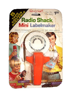
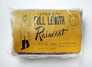
DON'T BE WITHOUT LIGHTS :: At SILO we position ourselves as a design source for our clients. To keep our creative tank full and shining bright we are constantly looking, collecting and storing what we find today, as fuel for tomorrow's creations. Often we draw inspiration from our natural surroundings, paying close attention to the details of everyday life. However, a stroll through the flea market can also provide you with plenty of inspiration. Occasionally, we feel compelled to share some of the objects we (re)discover. Attached are a few examples – created in the 1950's, 60's and 70's – of simple objects that have touched all of us (or our parents) at one time or another.


Wednesday, January 6, 2010


AIRMAN TALKING :: As much as these labels inspire me from a design point of view, their history tells a deeper story. They are a symbol of conversations between friends, hard times, good times and courage. My father-in-law was an Airman in the Canadian Armed Forces who was posted in England during the end of World War II. He shared many sad stories with me concerning losses during that terrible war. These labels represent positive moments during a difficult time. He carefully removed each beer label from the bottle as a reminder of a new friend and good conversation held in different pubs throughout England. What I find inspiring is that he took the time to mark each moment, realizing that they were special. Then he carefully stored all of the labels in his pay book (a pocket sized book each soldier carried with them at all times) for safe keeping.

Sadly, my father-in-law passed away recently. While sorting through his possessions we found his pay book and these labels. When I found out about what they represented, I couldn't help but be reminded about how courageous all of those soldiers were, and the major commitment and sacrifices they made.

Perhaps the next time you are out with family, or a good friend, or new friend and you are having a really good time, you might be inspired to mark it in your own special way...store it into memory and capture the moment. I know I will.

Thursday, December 10, 2009


YOUTH + DECAY (Y+D) :: In this series attention has been paid to the broken down metal, the cracking bricks, the decay of the materials that we use to construct our physical environment. The figure (human body) represents the youth that our culture desperately chases and struggles to maintain throughout our life journey. The combination of the decaying materials and the youthful body is a glimpse into our future as we corrode like the environment that surrounds us. We are no different than the objects and structures that we build – we all share a limited lifespan. However, decay does not have to be ugly, it can be beautiful, depending on how it is perceived. Y+D reveals decay in a beautiful and sensitive way, but does not exclude the aura of the inevitable departure we all face.


© 2009. SILO Design Group Inc.


Thursday, November 12, 2009

JAMMIN :: This parking ticket became the inspiration for a custom type heading for a poster design. Below is the type design in it's rough stage (West 47th). The letterforms were created using the numbers in red. Somehow, I find this process sketch more interesting than the final result (which I might post one day). I love the look of notes, sketches and thoughts.