Wednesday, May 5, 2010


RETROACTIVE INTERACTION (RI) :: Thinking about visual communication is something we take very seriously at SILO. Whether it be a corporate design solution, or a concept for installation art, the message is key.

In creating RI, we got our hands on an old fashioned table juke box. The kind that used to adorn the tables of the deli’s and diners my parents took me to as a young child. Back then, I was fascinated by the look, the buttons, the letters, often fiddling and flipping with the machine without ever listening to the music inside. RI explores that concept, the interactivity with the buttons and panels – the machine – to view art rather than listen to music. Each panel hosts a different piece of art, each exploring the memories of childhood curiosity as well as the representation of smells and textures concerning the surrounding environment – the restaurant. RI also forces the user to use the machine in a term for which it was not intended, in turn allowing us to question the expectations we place on objects derived from their appearance...from their design.

Friday, April 9, 2010


SO WHAT IS IT? :: It all started with a simple sculptural concept – build a gravity driven device which will mechanically engage and rotate a wheel of art to achieve a visual illusion. An elaborate build to achieve a simple action and result. Art spinning art to create more art.


Thursday, March 4, 2010


TENSE TYPE :: Custom letterform design always adds impact. In this case TENSION explores the constraints of creating letterforms maintaining a triangular shape to achive its originality. The I,O,N interact with each other, complete each other and create illusion. The sample above is a crop from a poster designed by SILO for an exhibition of wordmarks. Below are a few exploration sketches for future applications and extensions of the wordmark.


© 2010, Silo Design Group Inc.

Tuesday, February 9, 2010


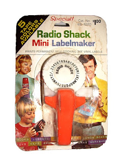
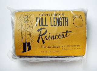
DON'T BE WITHOUT LIGHTS :: At SILO we position ourselves as a design source for our clients. To keep our creative tank full and shining bright we are constantly looking, collecting and storing what we find today, as fuel for tomorrow's creations. Often we draw inspiration from our natural surroundings, paying close attention to the details of everyday life. However, a stroll through the flea market can also provide you with plenty of inspiration. Occasionally, we feel compelled to share some of the objects we (re)discover. Attached are a few examples – created in the 1950's, 60's and 70's – of simple objects that have touched all of us (or our parents) at one time or another.


Wednesday, January 6, 2010


AIRMAN TALKING :: As much as these labels inspire me from a design point of view, their history tells a deeper story. They are a symbol of conversations between friends, hard times, good times and courage. My father-in-law was an Airman in the Canadian Armed Forces who was posted in England during the end of World War II. He shared many sad stories with me concerning losses during that terrible war. These labels represent positive moments during a difficult time. He carefully removed each beer label from the bottle as a reminder of a new friend and good conversation held in different pubs throughout England. What I find inspiring is that he took the time to mark each moment, realizing that they were special. Then he carefully stored all of the labels in his pay book (a pocket sized book each soldier carried with them at all times) for safe keeping.

Sadly, my father-in-law passed away recently. While sorting through his possessions we found his pay book and these labels. When I found out about what they represented, I couldn't help but be reminded about how courageous all of those soldiers were, and the major commitment and sacrifices they made.

Perhaps the next time you are out with family, or a good friend, or new friend and you are having a really good time, you might be inspired to mark it in your own special way...store it into memory and capture the moment. I know I will.